Poster
Posters are the most literal example of art & design coexisting in the same space.
In my opinion, there is still no superior way to convey a message through visual communication, succinctly than with a single A4 piece of paper.
A poster can do so much with so little. It can change the world or just make someone laugh and it does this whilst being able to inhabit a versatile space, being able to be placed anywhere and mass produced so that a message can be spread to infinite eyes.
This is a collection of posters I created through varied mediums. From Screen printing to collage through to 3D modelling and photography. To find out more about the creation of some featured works, scroll past the gallery.
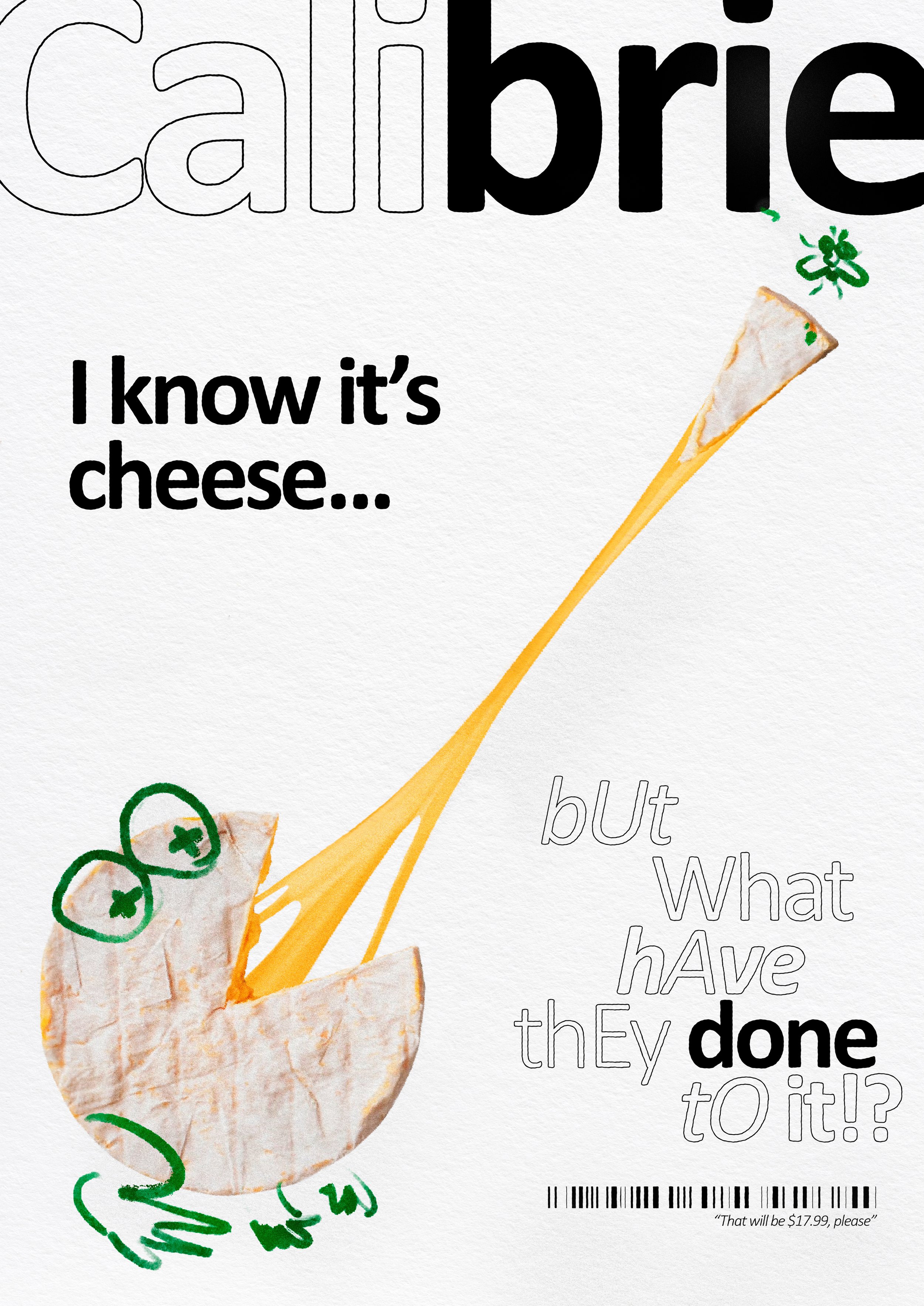
'Calibrie' Part of '7 days of bad fonts, Calibre'. It's a play on the font used, Calibre, and the cheese, Brie. I was displeased with the price of cheese at the time and the peculiar nature of Brie.
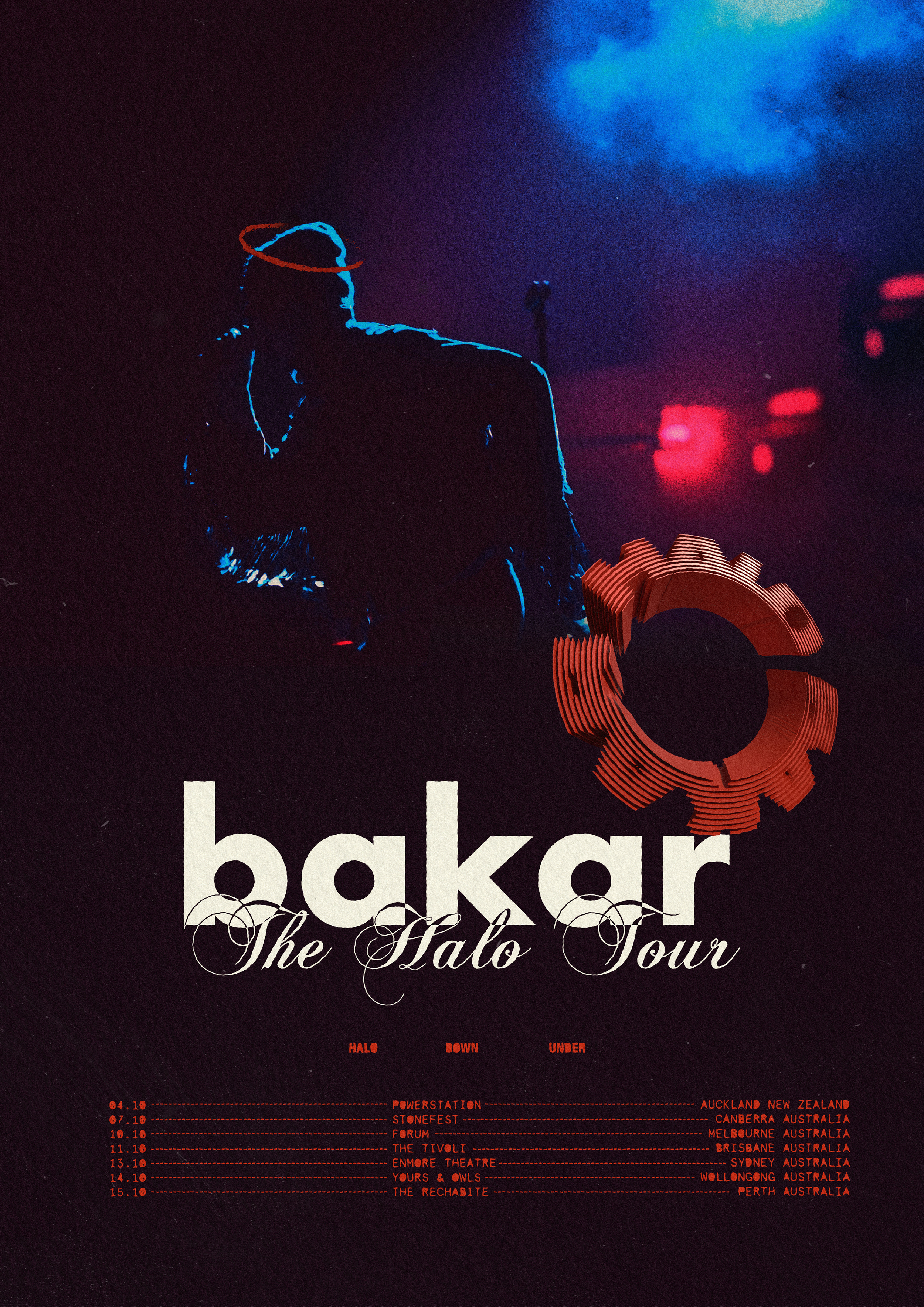
'Bakar Halo Tour Poster' Inspired by Bakar's Melbourne concert, this poster features a photograph I took of Baker at the concert.

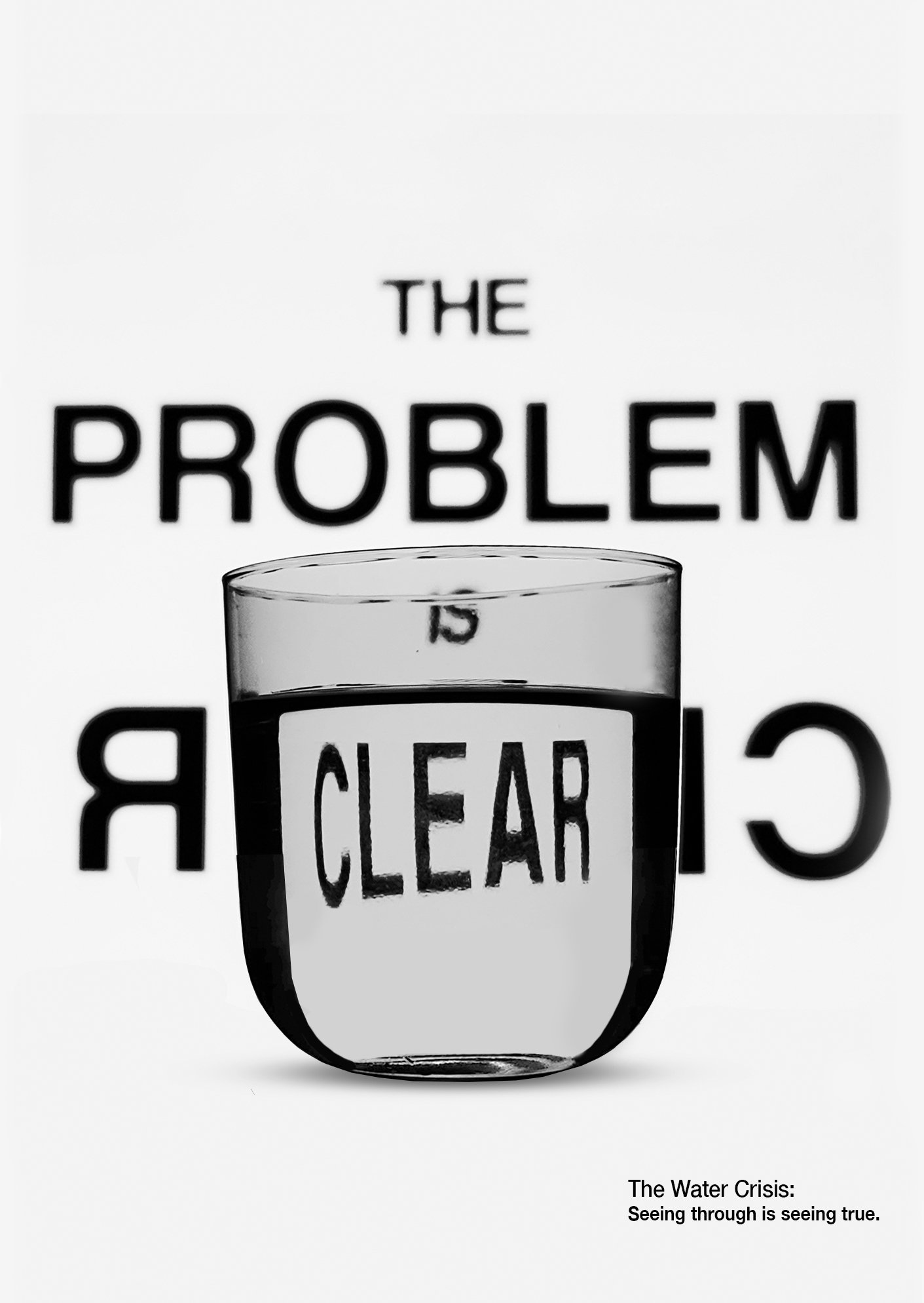
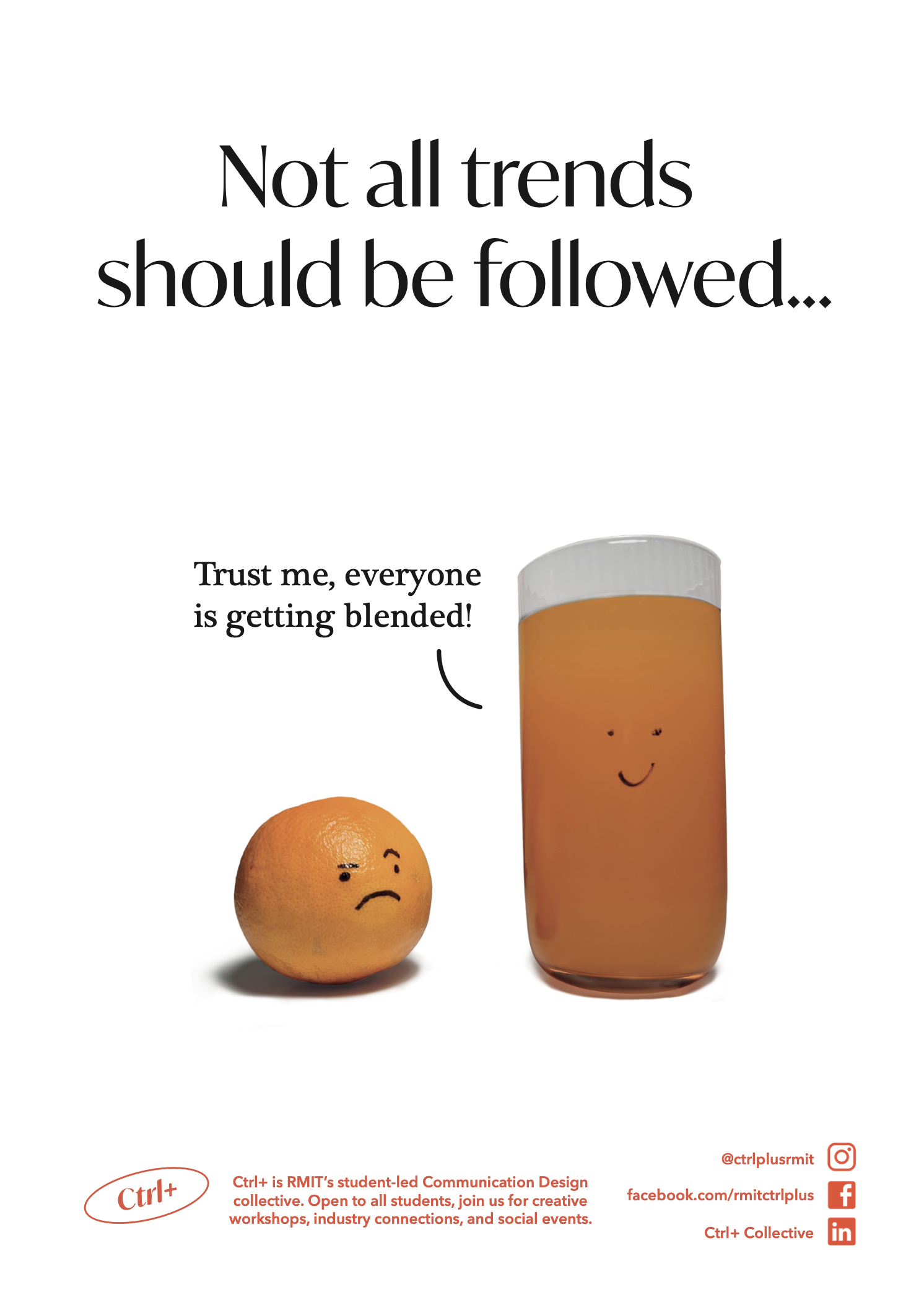
'The Problem is Clear' Poster for campaign against water shortages made using refracted water.
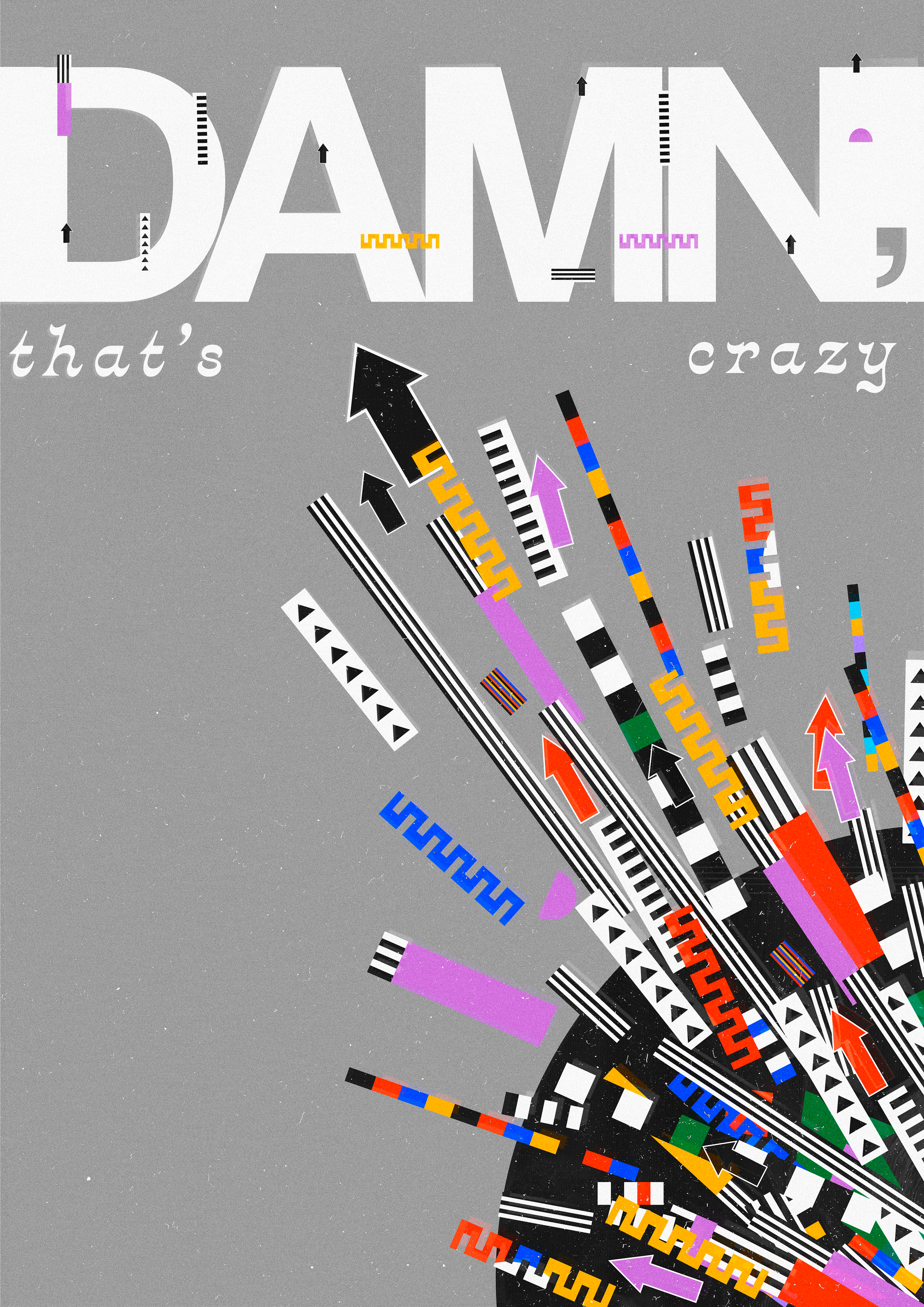
'DAMN, that's crazy' I wanted to represent energy and juxtapose that with a traditionally un-energetic and underwhelming response: "Damn, That's Crazy". Created using Adobe Illustrator and Photoshop.
'IT'S OK TO CRY OVER SPILT MILK, It's quite expensive nowadays'. Part of '7 days of bad fonts, Impact' When I made this poster, I was feeling pretty sensitive. The slightest inconvenience would illicit an overblown, negative response. This work was a way of telling myself that feeling this way is ok. It's ok to cry over spilt milk because it's expensive now, it's more inconvenient than ever before in history and that's ok. I 3D modelled and rendered the milk bottle and spilt milk using adobe dimensions.
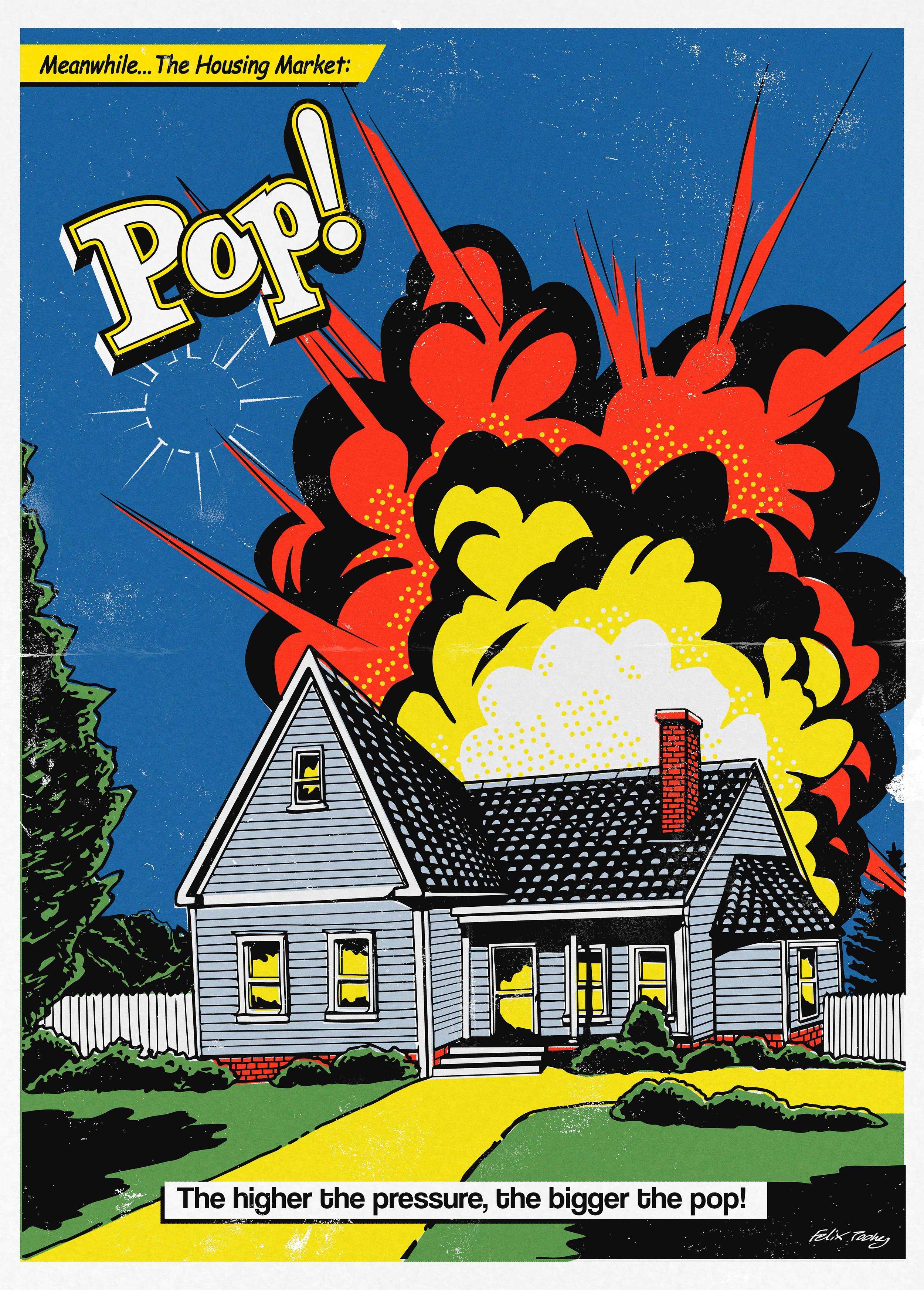
'Pop' A Roy Lichtenstein inspired poster depicting the housing crisis.
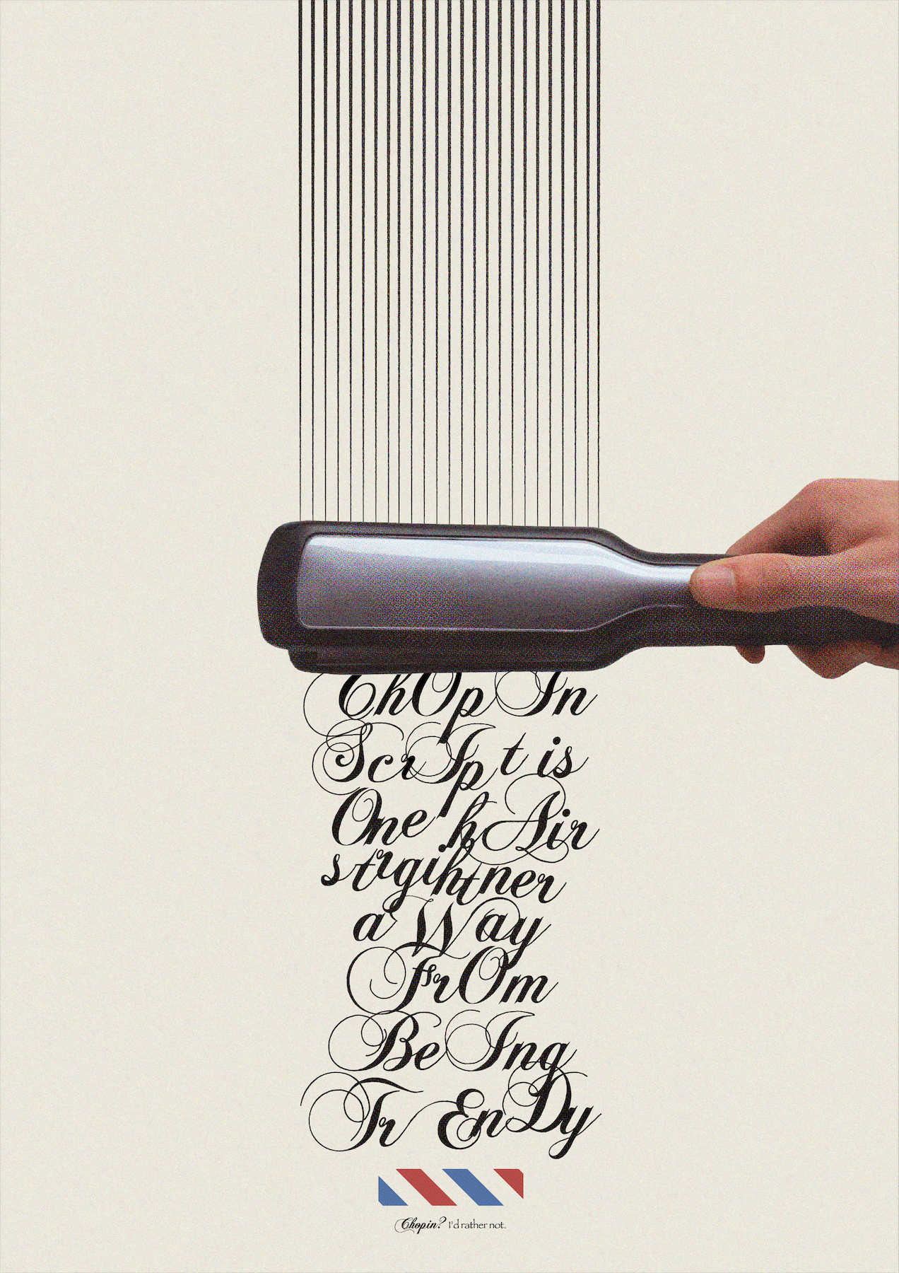
'Chopin Script is One Hair Straightener Away From Being Trendy' Part of '7 days of bad fonts, Chopin Script'
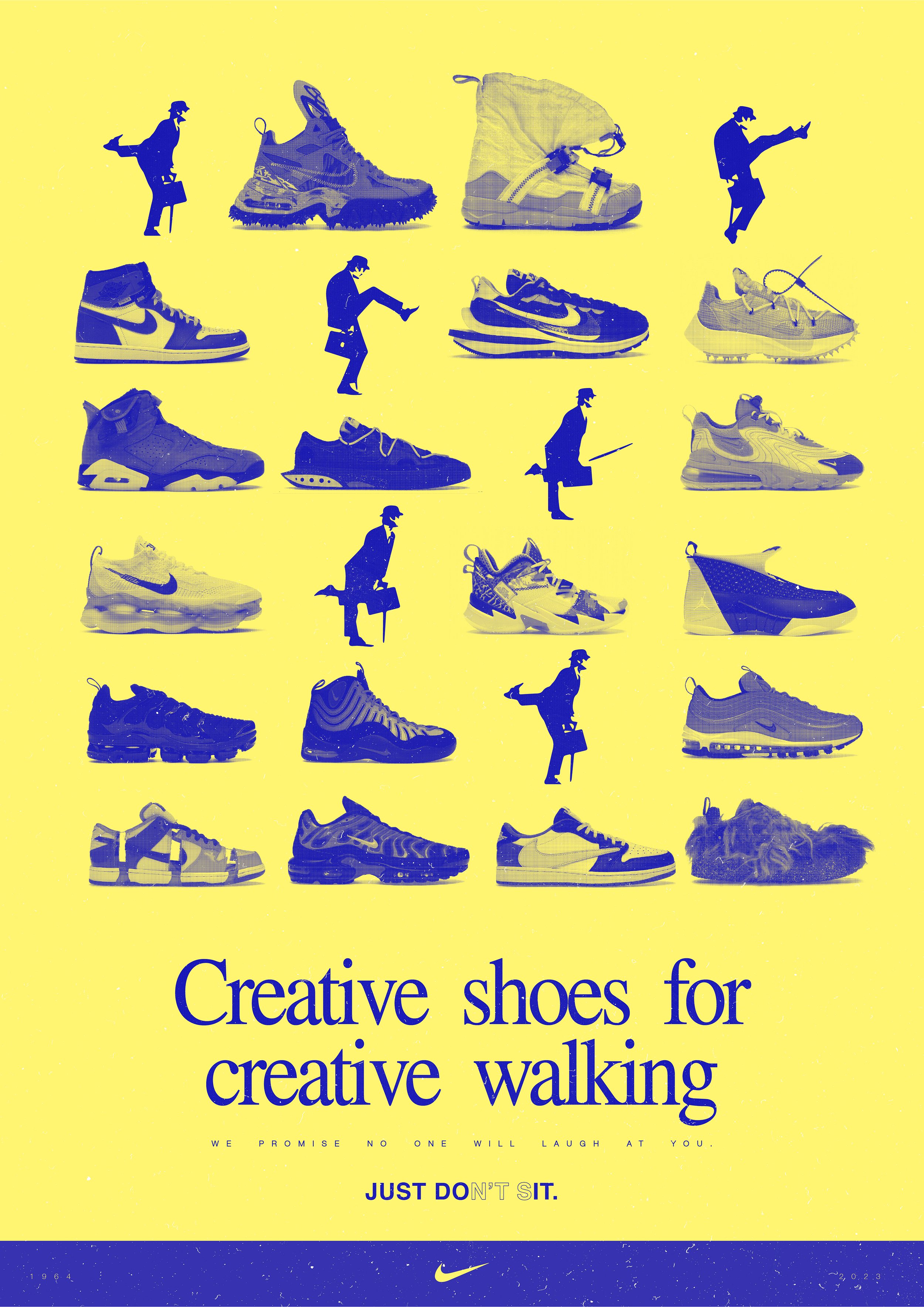
'Creative Shoes for Creative Walking' I am a big Monty Python fan and I also love shoe design. This is a response to the crazy shoe designs that Nike has been putting out into the world. It begs the question, if your shoes are creative, should you walk creatively too? Just Don't Sit.
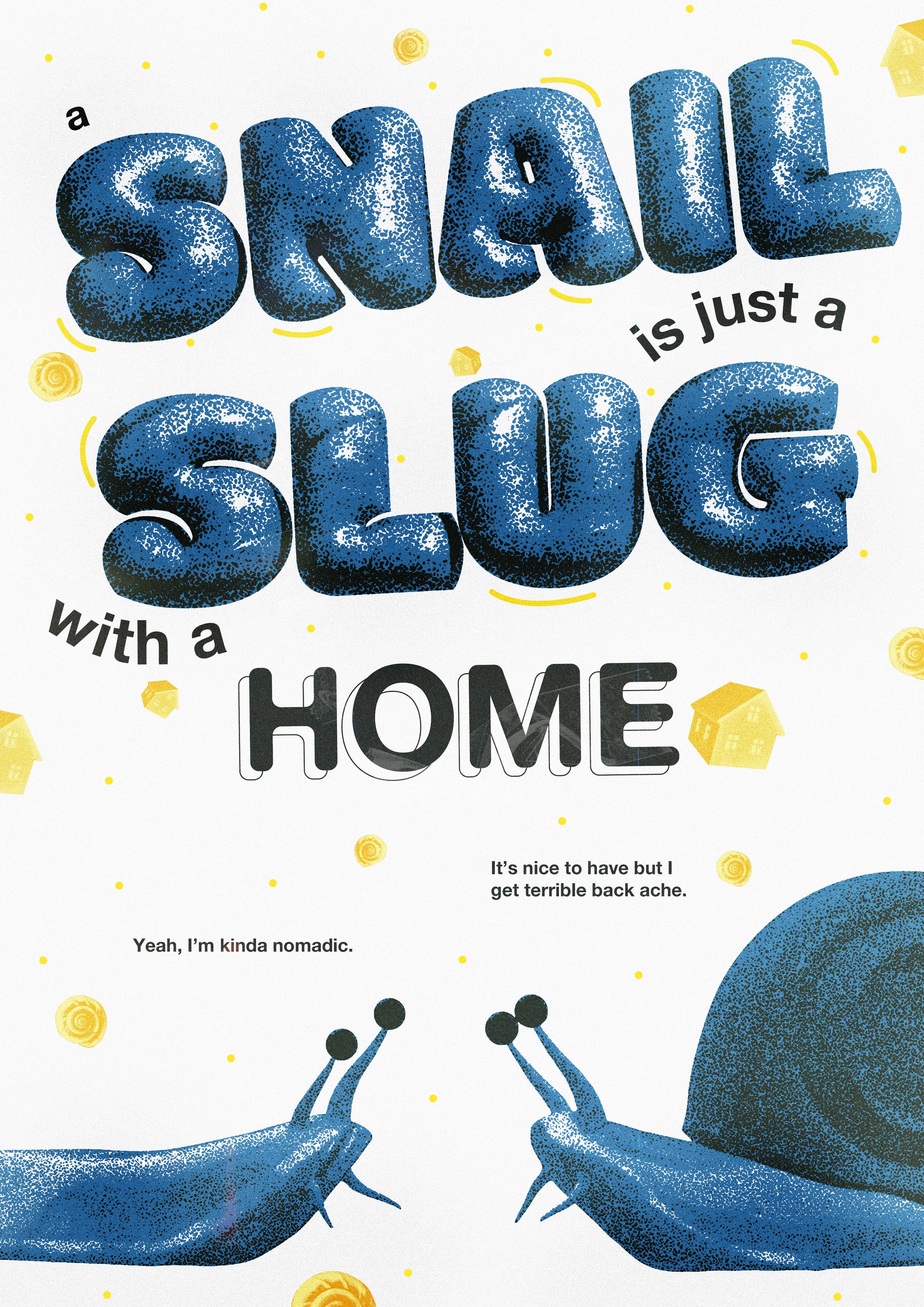
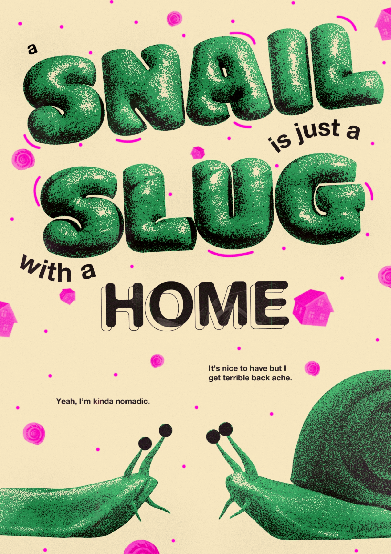
'Snails & Slugs' Born from contemplating the differences between snails and slugs. The text, slug and snail were 3D sculpted by me and turned into bitmaps on photoshop, giving them this halftone effect.
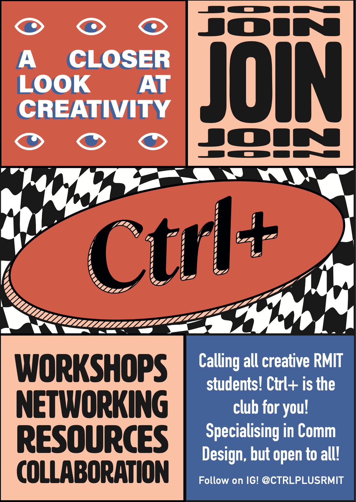
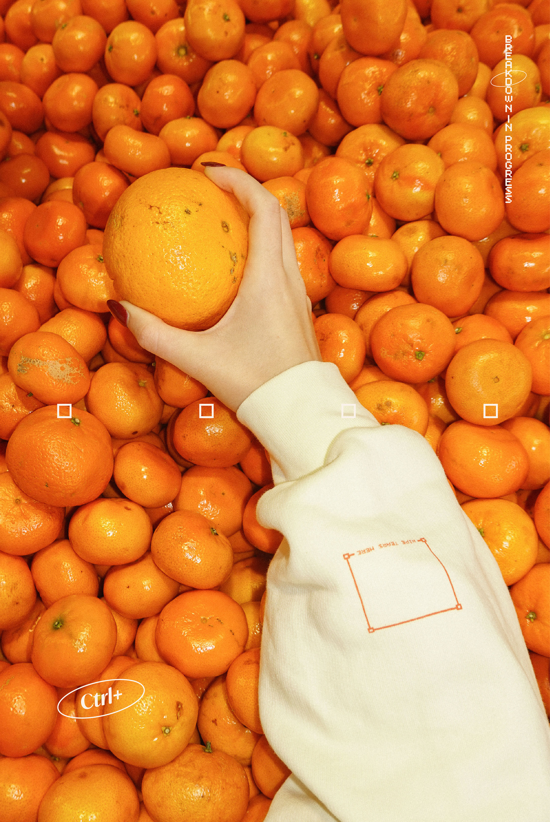
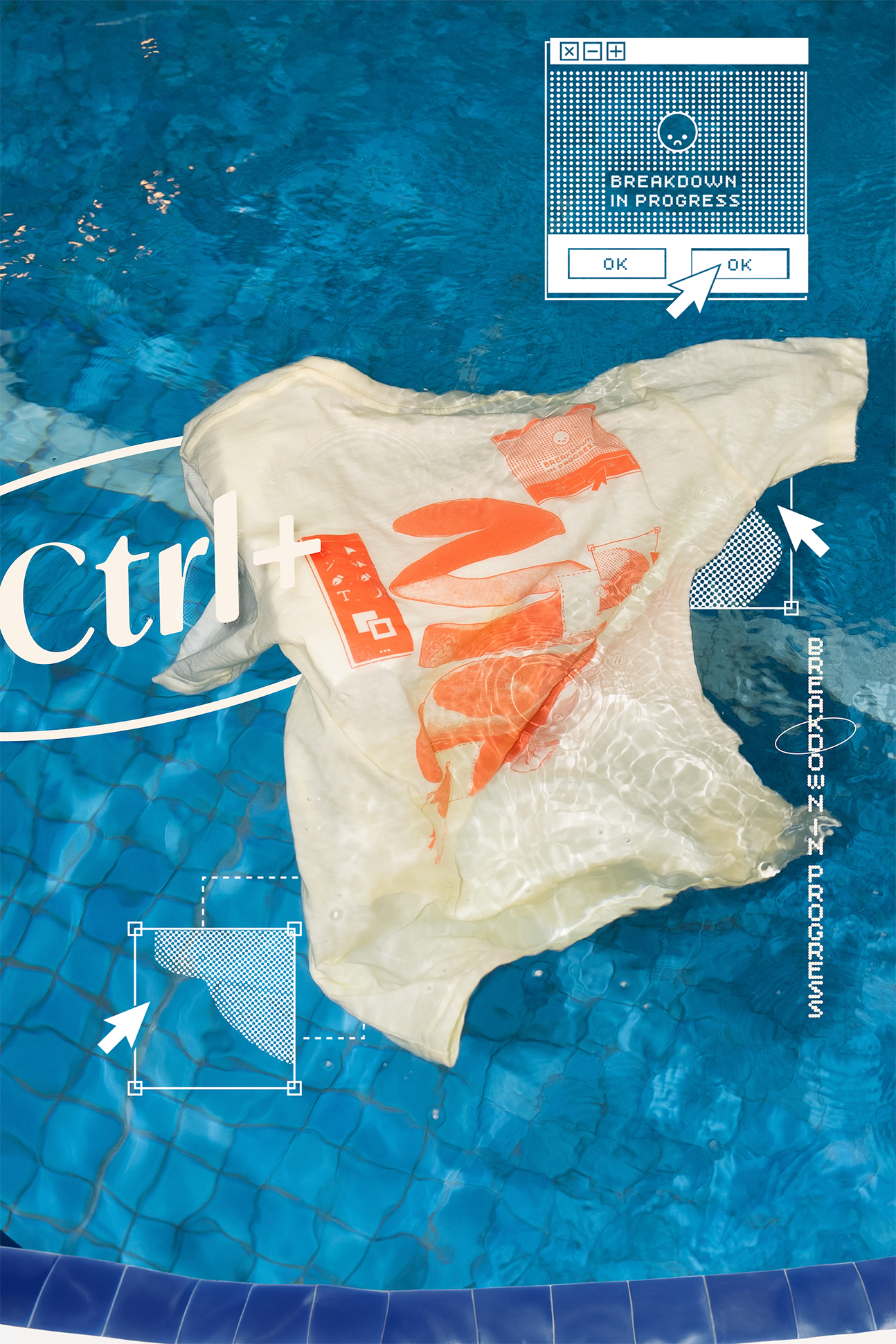
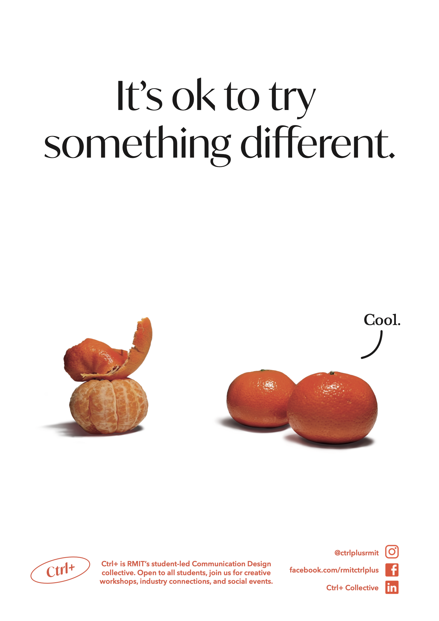
'Ctrl+ Recruitment Poster' Commissioned by Ctrl+, RMIT's Communication Design club and put up all around RMIT University.
'Sunshocked' A response to the toxic nature of Twitter, now X. The internet would block the sun if it could.
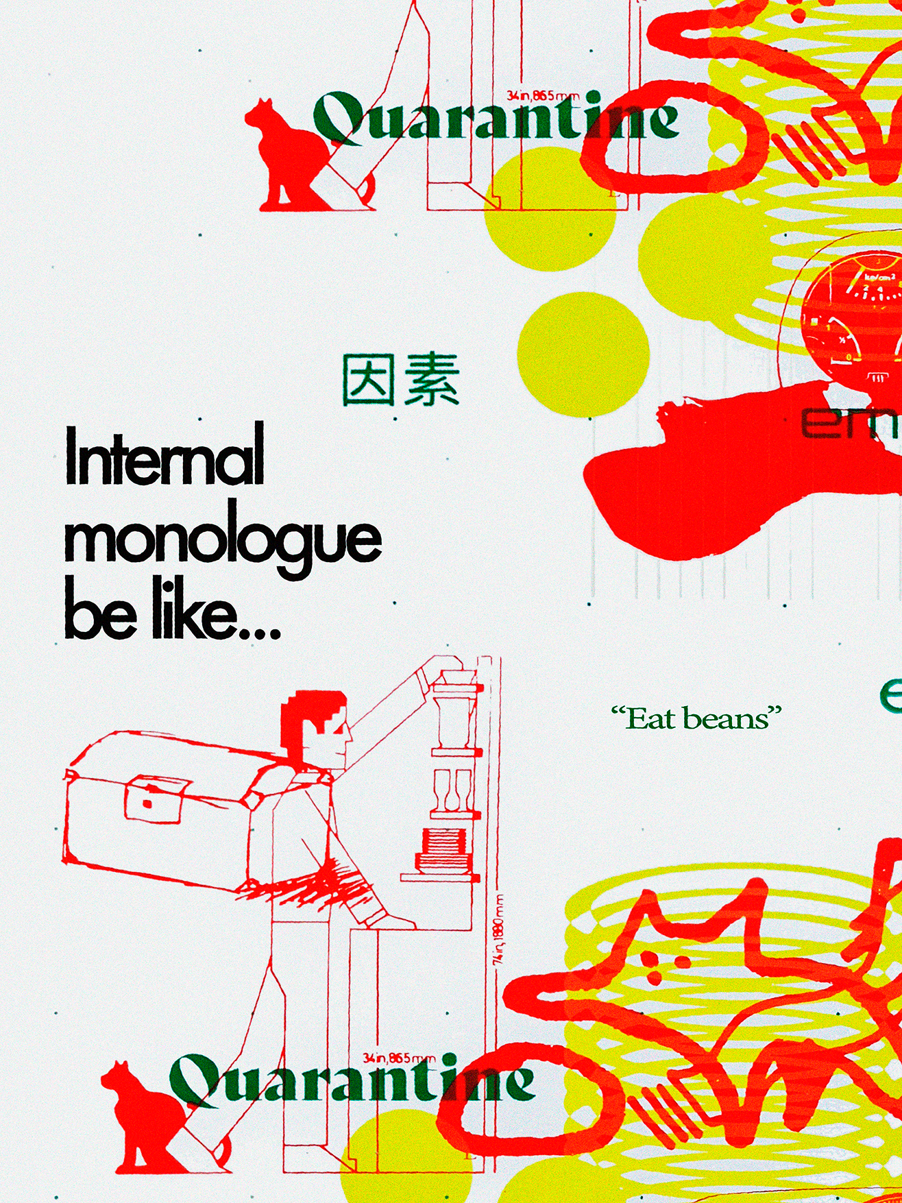
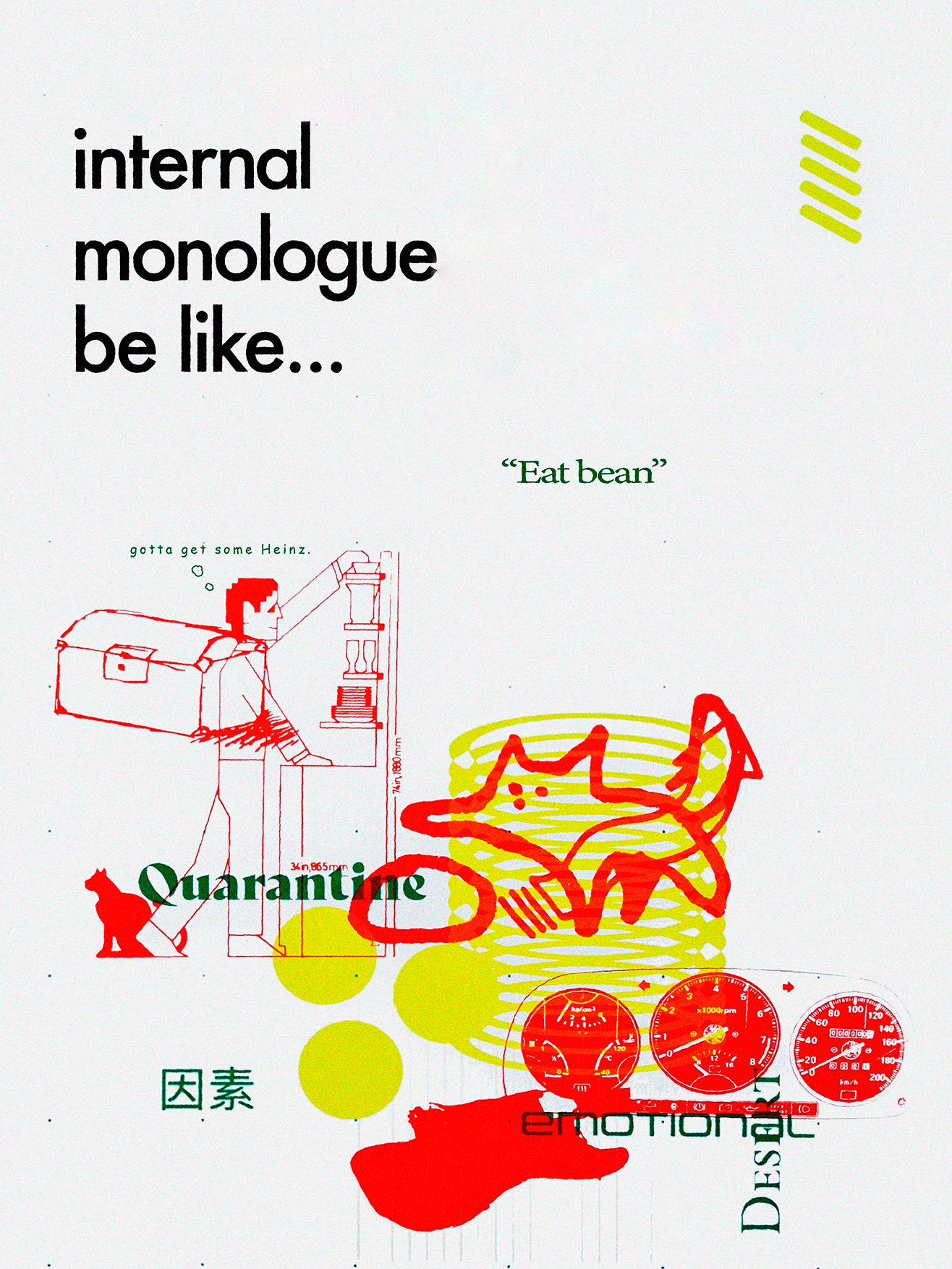
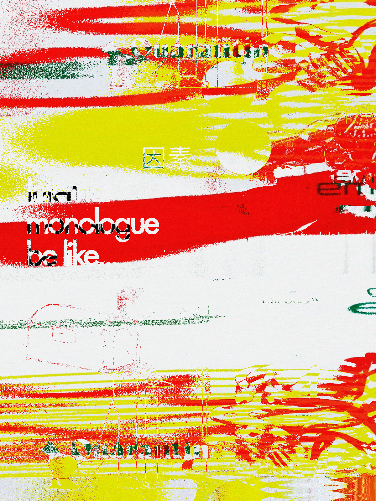
'Internal Monologue Be Like...pt 1' A collaborative design with RMIT's study tour. The composition was generated by feeding a program images and illustrations from book. We then screen printed these images onto paper stock. I added the type elements in Adobe Illustrator. It depicts my lust for Baked Beans during quarantine and the random nature of the internal monologue.
'Internal Monologue Be Like...pt 2' Alternative composition.
'Ctrl+ Marketing Poster' Advertising the merchandise line I created for Ctrl+.

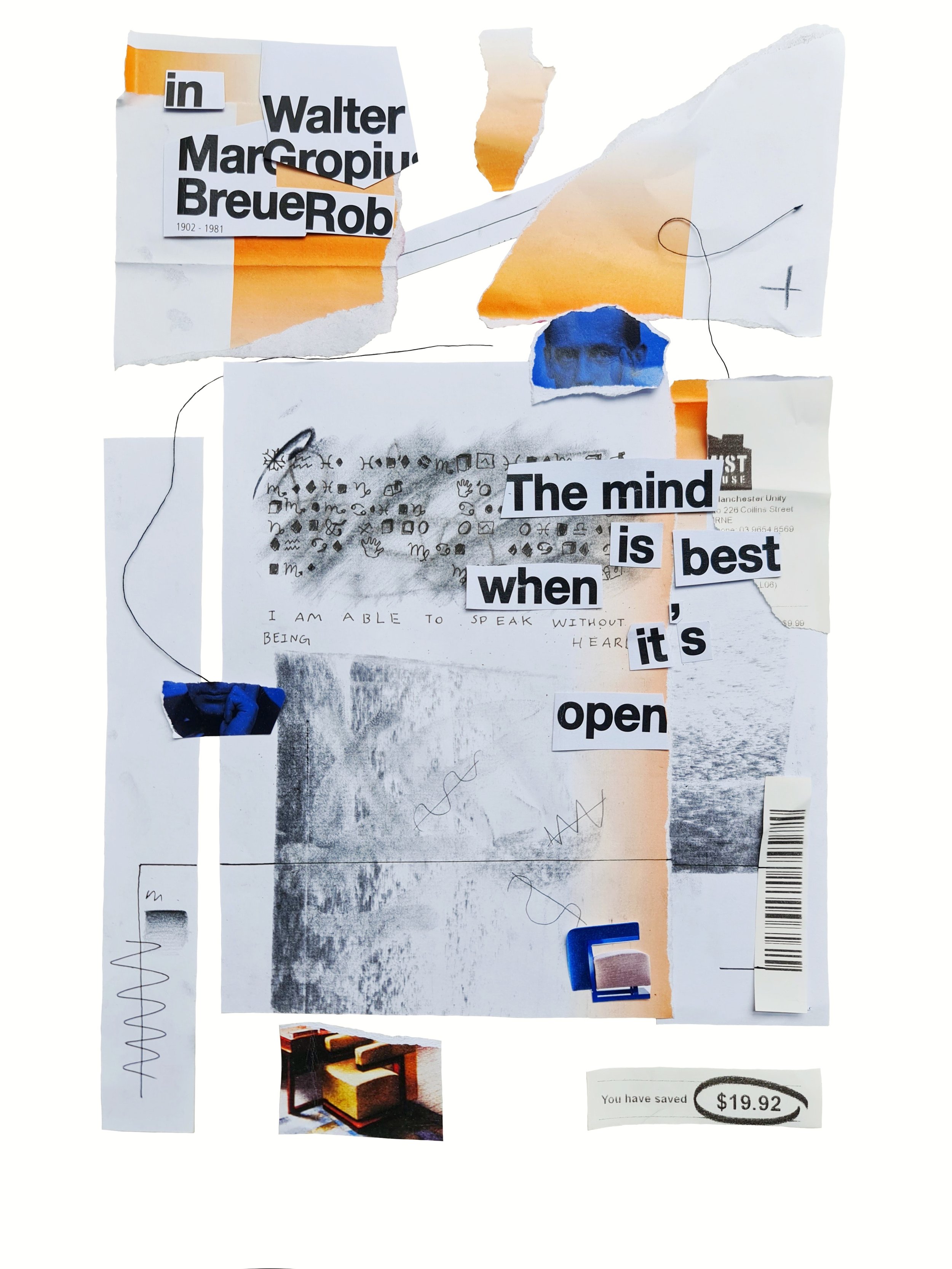
'The Mind is Best When It's Open' Collage poster.
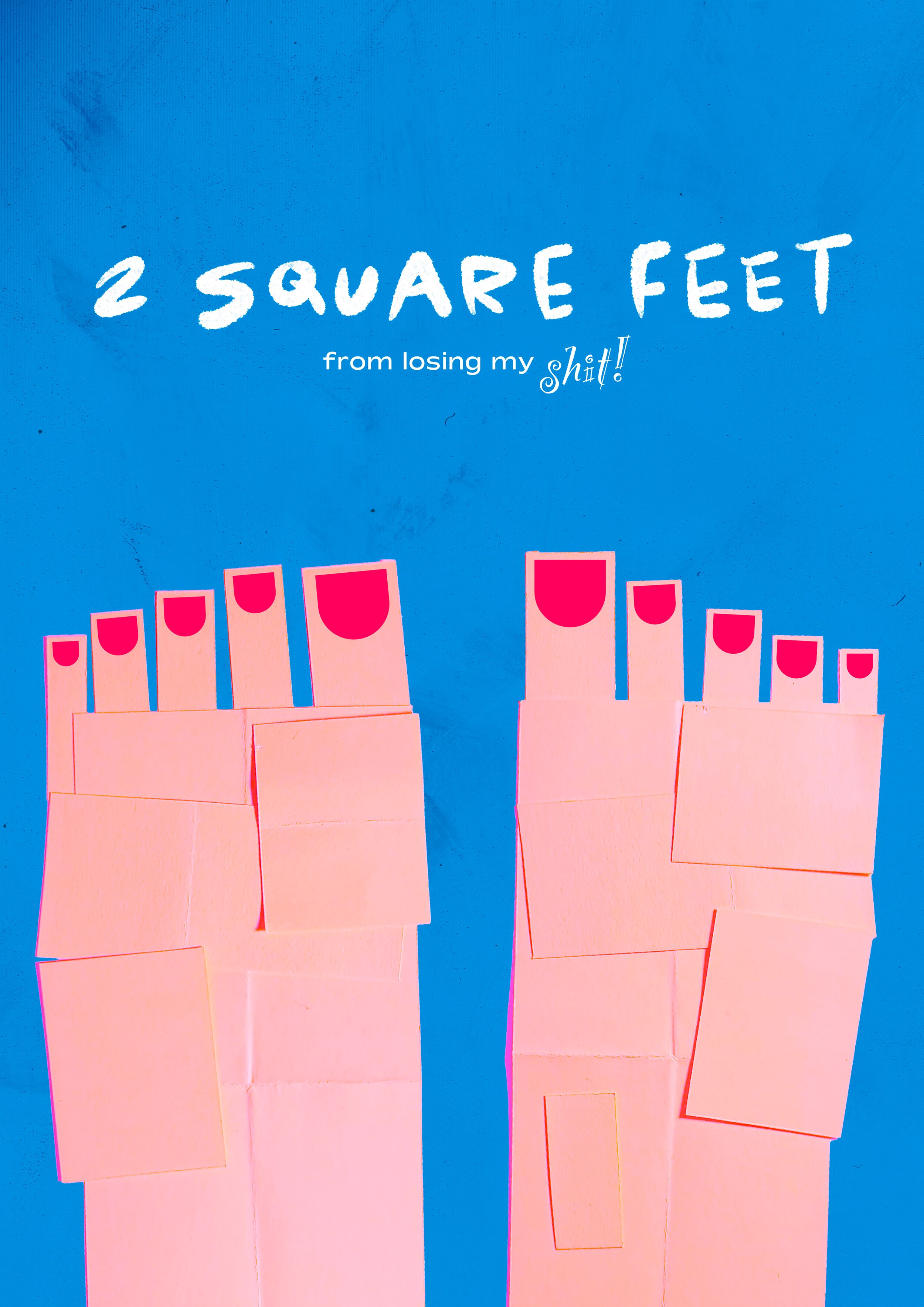
'2 Square Feet' this poster has many layers to it, both in paper form and in meaning. I'll let you figure it out.

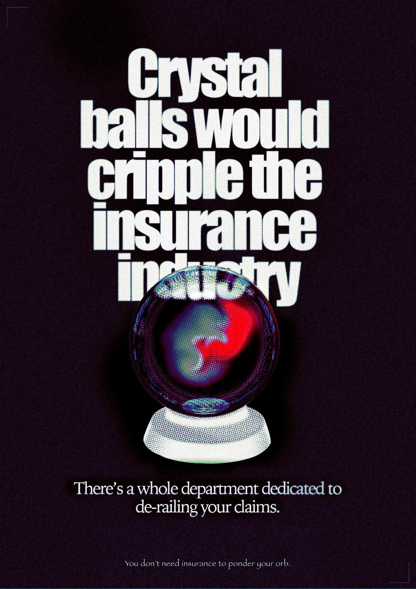
'Crystal Balls' Part of '7 days of bad type, Impact & Papyrus' My uncle once told me that insurance companies have whole department dedicated to derailing claims. I got depressed about it and tried to think of ways around them. Turns out crystal balls would stop 99% of accidents from happening in the first place.
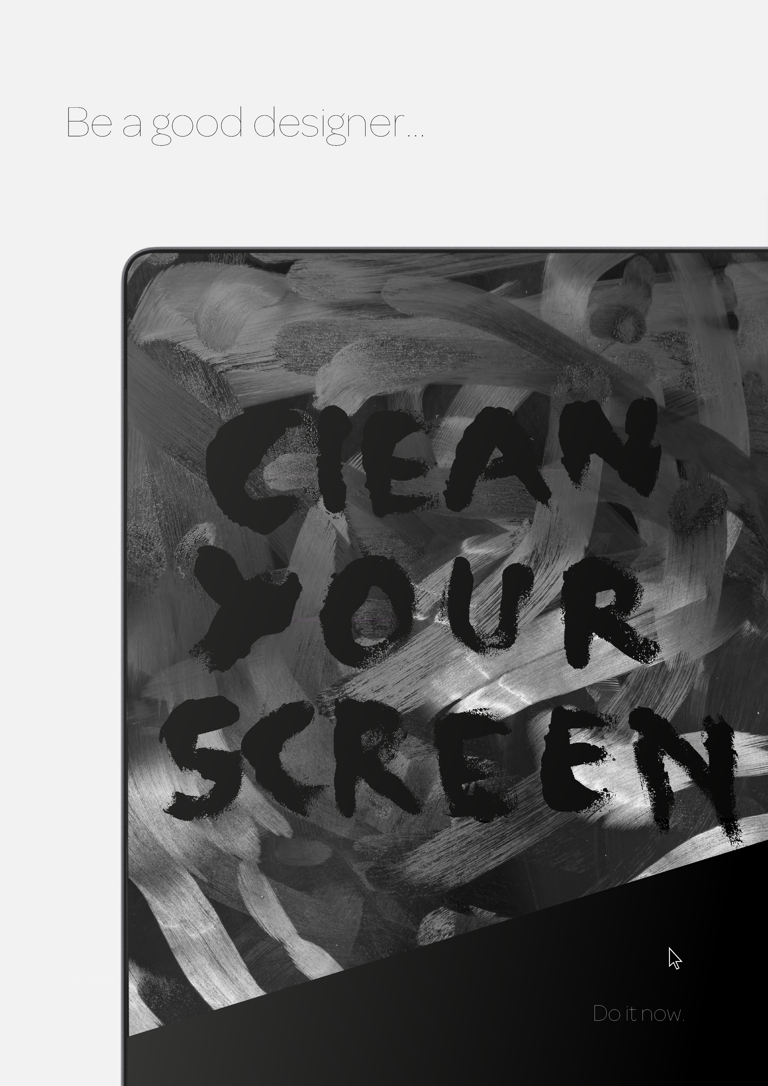
I'm a bit obsessed with cleaning. I even went as far as to purchase Apple's official cleaning cloth. This was my appreciation poster and also my plea to other designers to clean their screens.
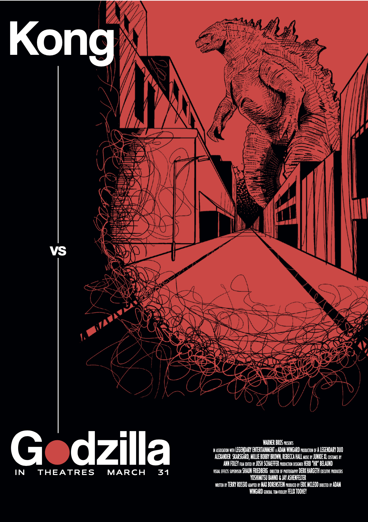
'Godzilla vs Kong Horror Movie' Alternative poster design for the movie, Godzilla vs Kong.
'Ctrl+ Marketing Poster' Advertising the merchandise line I created for Ctrl+.
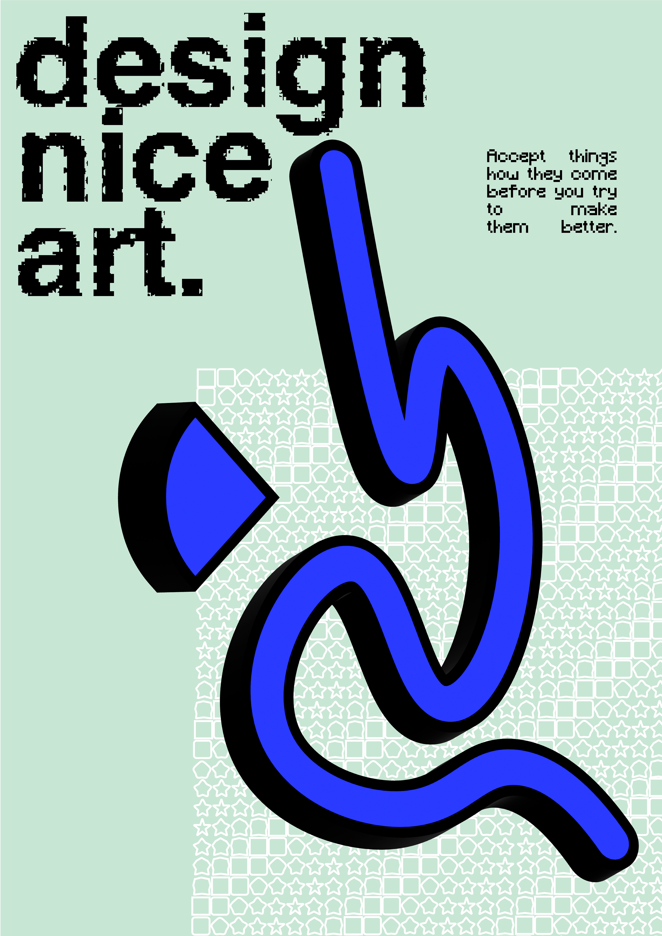
'Design Nice Art 1/4' Created from elements of the No Bull Cause's 2nd season of clothing designs.
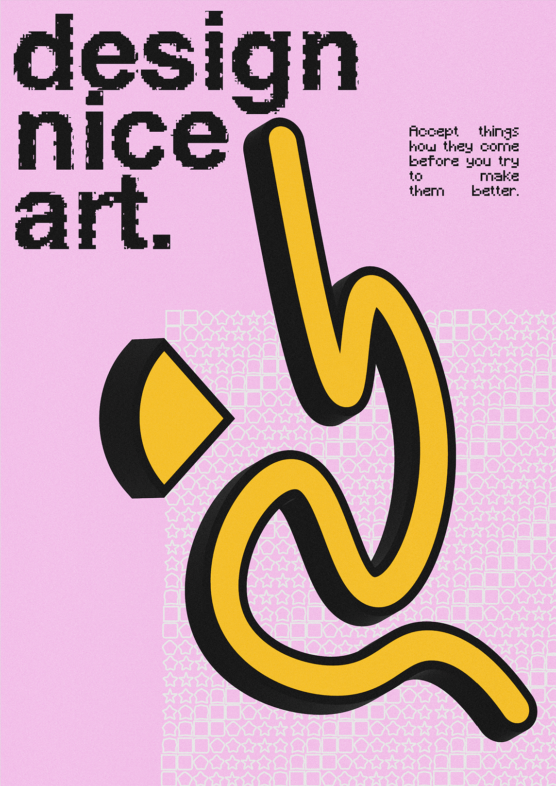
'Design Nice Art 2/4'
'Design Nice Art 3/4'
'Design Nice Art 4/4'
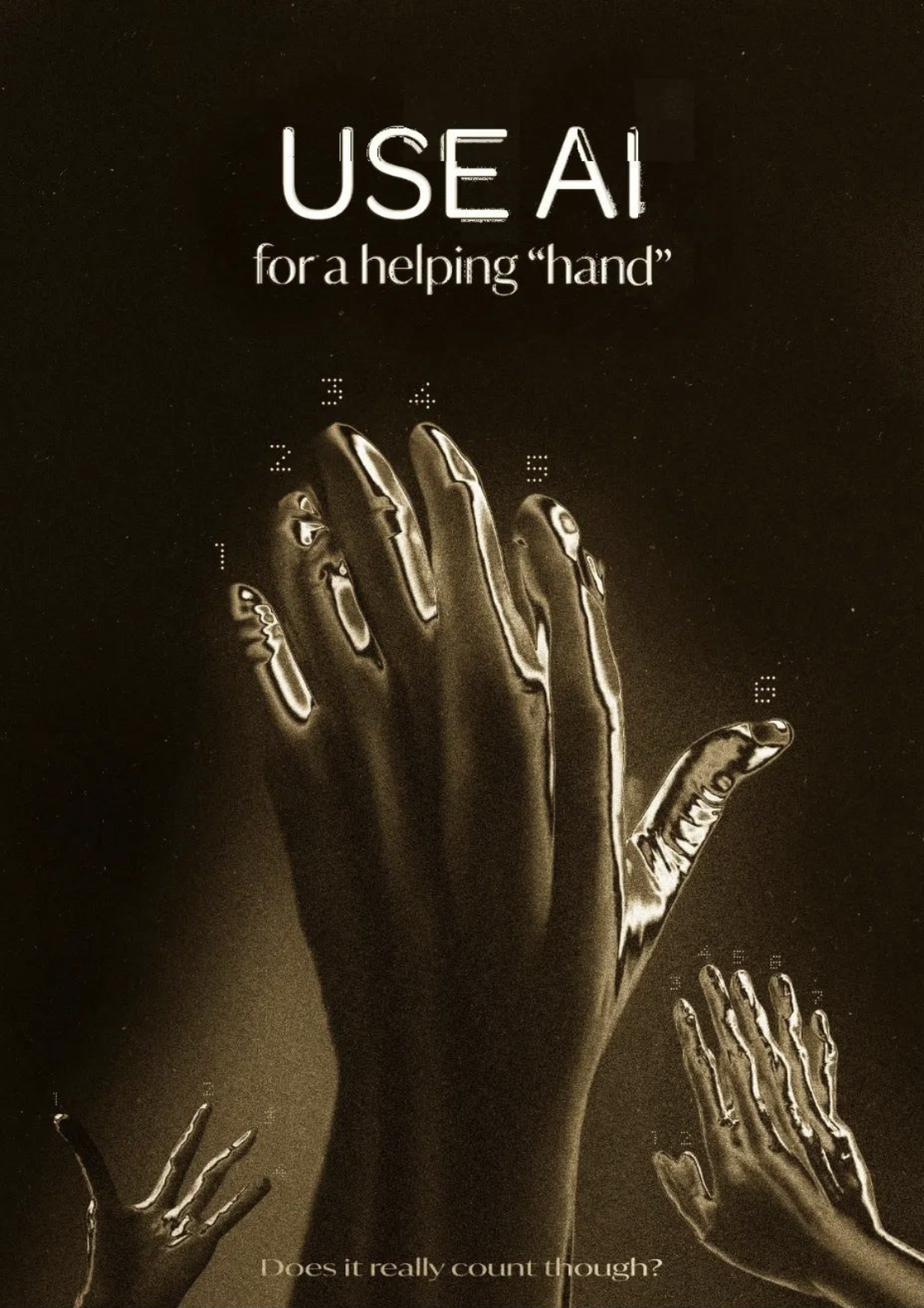
'Use AI For A Helping Hand' A comment on the unpredictability of asking Ai for creative help. If you ask it for a helping hand, it'll give you one with 7 fingers. The hands here were generated with Ai and modified Within Photoshop to give them this chrome effect. this is the only instance of Ai in my personal work.


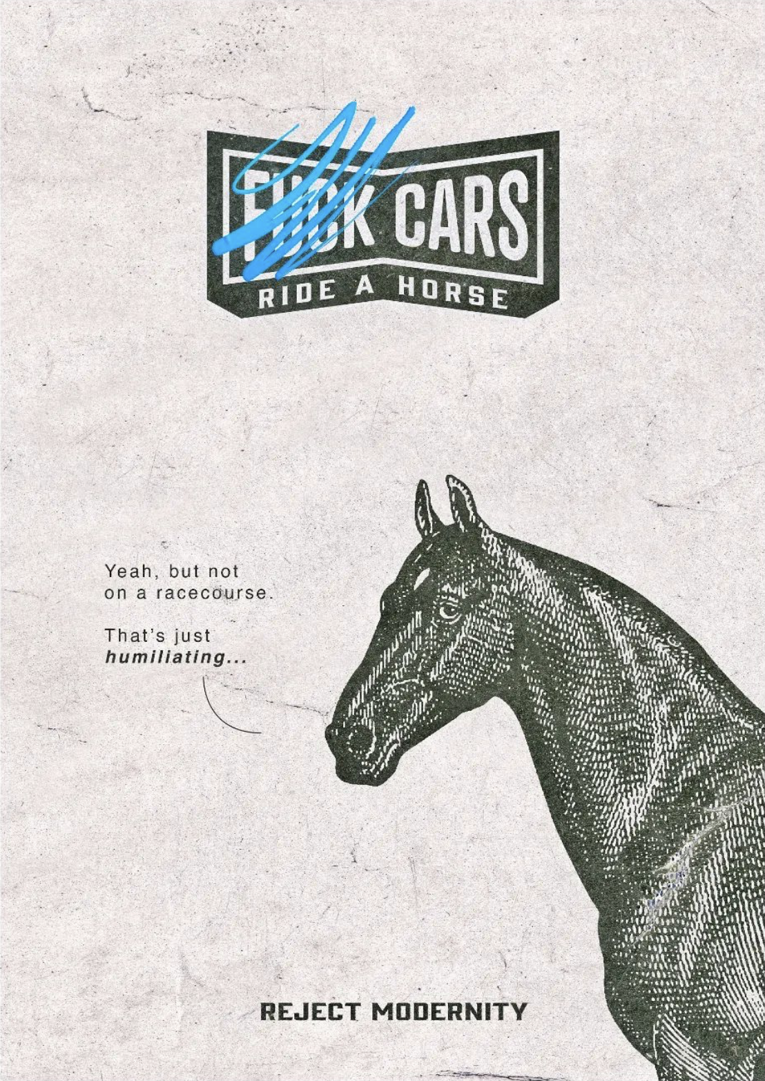
'Ride a Horse' Reject modernity, ride a horse.
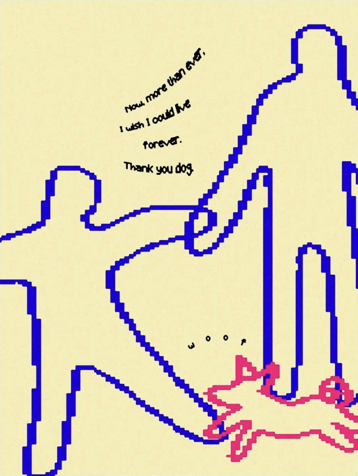
"Now more than ever, I feel I could live forever' A dog appreciation poster.
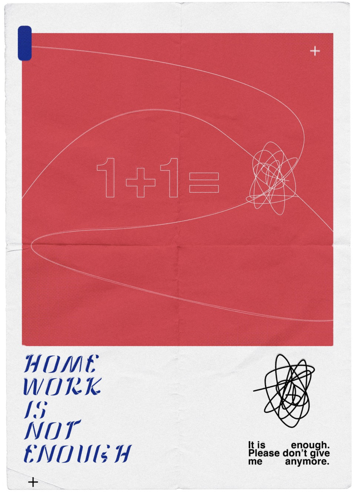
'1+1' I have never been gifted at mathematics. It perplexes me. this poster represents the sort of thing I'd see when staring blankly at maths homework. Scribbles. Also this has a custom typeface.

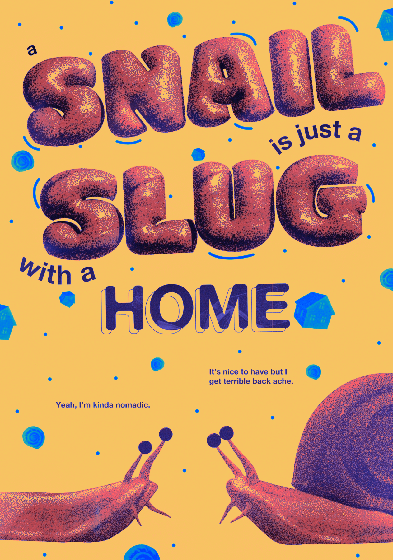
'Snails & Slugs' Variation.

'Snails & Slugs' Variation.
Internal Monologues
'Internal Monologue Be Like...’' Is a collaborative design with RMIT's study tour. The compositions were generated by feeding a program images and illustrations from books and artworks. We then screen printed these images onto paper stock with Troppo Print. I added additional type elements in Adobe Illustrator.
My interpretation of the compositions is that it depicts the random nature of the internal monologue, something that controls our lives and keeps us company but doesn’t always make a whole lot of sense.

Snails & Slugs
“A snail is just a slug with a home”. Do snails think of slugs as nomads? This poster was an excuse to experiment, like most of my posters. It’s where I learn new ideas and present them to the word for feedback. I wanted to get better at 3D sculpting, so I sculpted this snail and slug. It’s a simple idea that represents my own reservations of what home is.
“It’s nice to have but I get terrible back ache”
“Yeah, I’m kinda nomadic”
the creatures, in a way, represent my own inner dialogue.


Spilt Milk & Anxiety
‘It’s ok to cry over spilt milk’. I communicate through these posters. They are my way of trying to deal with whatever is going on in my life at that point. This poster was designed to comfort myself and others. If you have an emotion, don’t suppress it, even if you do end up crying over spilt milk. Any opportunity to cry should be taken, bad things happen if we can’t express our emotions confidently.
I created a simple milk brand(Can’t Quite Milk) for this poster and applied it to a model of a milk bottle and rendered it in a high resolution. “Can’t Quite Milk” is a reference to “Can’t Quite Cola”, a fake brand I created for ZeroTag when it was first being conceived.

Meanwhile, The Housing Market.
I wanted to draw a classic comic book house in the way they would’ve done it in the 1950’s. I started by doing a pencil and ink drawing, digitising it an colouring it on the computer, the same way a printer might. With off-set and a limited colour pallet.
The relevance of this style is that the “pop” or boom is referencing the baby boomers who were born around the time this comic style will have been published. On the whole their experience with the housing market was built upon the idea that property would always go up. But this can’t happen forever, the bubble will pop eventually. For my generation it simply isn’t as easy as it was for the baby boomers to buy a house. The bubble is bursting.
Tap video to pause.